
.png)
Making collaborative travel planning fun!
Planning a trip is stressful... until now!
Planning a trip can cause stress with all of the website cross analysis, price comparisons and to top it all off having to share said findings with guests who are joining the trip! What if there was a platform that solved all of these issues in one place? Introducing Galavant!
TIMEFRAME:
6 Weeks (100 hours)
ROLE:
Solo student project
Mentor: Pelumi A.
PROJECT TYPE:
Mobile- first, responsive app
TOOLS:
Figma, Figjam, Optimal Work Shop, Zoom
Discover with Research
Competitive Analysis
Compare and contrast existing apps and websites to see what already works well and any features that could be improved.
Main Take Aways:
Organization: sites like to group information
Features: all sites like to combine features to allow for easy booking
Recommendations:
Collaboration: create an easy to use collaboration
feature
Inclusivity: create a platform that is appealing to all ages and cultures

User Interviews
Use qualitative research on user’s motivations and pain points. Review existing travel planning processes.
Demographic
Ages 24 - 72 years old and 4 different ethnicities
Experience
All have traveled or planned a trip in last 1-3 years
Interview Debrief
I was able to gather the feed back by using a chart with all of the people I interviewed. This made it easier for me to look for details at a glance

Defining the Problem
Affinity Mapping
Organizing data to find common themes from the conducted interviews

We were able to create an affinity map based off the survey answers and identify the key points that user's struggle with when planning trips.

The results were categorized based off of how often people shared this same issue or concern. In this case familiarity, costs and reliability is the most common.
POV's and HMW's
Summarizing the main pain points from the collected information to find solutions.
Point of View
How Might We?
How might we create an easy to manage group itinerary? How might we give better sharing access for itineraries between users?
How might we create an easy to use feature to cross compare multiple sites at a time?
How might we provide accurate information to properly inform a solo female traveler on how safe her transportation and lodging is?
I’d like to explore ways to help solo female travelers to have reliable resources to book their lodging and transportation because they are fearful of their safety when in unfamiliar places.
How might we provide accurate information to properly inform a solo female traveler on how safe her transportation and lodging is?
How might we create an easy to use feature to cross compare multiple sites at a time?
How might we create an easy to use feature to cross compare multiple sites at a time?
I’d like to explore ways to help budget conscious travelers to have a one stop shop for all of their travel expenses and booking because they are afraid they are not getting the best deal possible.
How might we provide accurate information to properly inform a solo female traveler on how safe her transportation and lodging is?
How might we create an easy to use feature to cross compare multiple sites at a time?
How might we create an easy to use feature to cross compare multiple sites at a time?
I’d like to explore ways to help users planning a group trip to have a single place that keeps the entire group informed and included because it will allow them to keep an itinerary that is consistent and inclusive of everyone’s input.
How might we provide accurate information to properly inform a solo female traveler on how safe her transportation and lodging is?
How might we create an easy to use feature to cross compare multiple sites at a time?
How might we create an easy to use feature to cross compare multiple sites at a time?
User Personas
These personas will give us a quick background of who our potential users are, where they’re coming from, and what their top needs and pain points are.


Design with Solutions in Mind
Ideate: Storyboard
After divergent thinking warm-ups and utilizing various brainstorming strategies, we came up with Galavant, a collaborative all in one travel planning app!

Ideate: Information Architecture
From these tests, we got a better understanding of what features were successful, important, or not important. The card sorting tests specifically helped us narrow down the amount of features we planned to include.


User Flow
We created two user flows to portray key tasks that our users will have to go through. The tasks we observed were Logging In and Adding a New Trip


Task Flow
Having the user personas and analyzing the information from our information architecture, we were able to narrow down what tasks we wanted to prioritize working on.

Wireframing: Low Fidelity
Using low fidelity wireframes, we are able to generalize placements and organization without spending too much time trying to perfect anything.
This is best for brainstorming and getting ideas out.


Wireframing: Mid Fidelity
After testing out multiple versions of low fidelity wireframes and receiving feedback from multiple sources, this allowed for us to further solidify what we want for the final product.
This allows for us to focus on bigger picture more than the details like color or fonts.

Visual and Brand Design: Mood Board
At this point, we wanted to make decisions on the brands look and its pillars. Galavant prioritized being inviting, adventurous, fun, useful, and evoke the want to explore!

Visual and Brand Design: UI Component Set
This was all inspired by the mood board and honed in on how to incorporate it visually. Here we settled on a single color scheme, chose fonts, and created an entire component library.


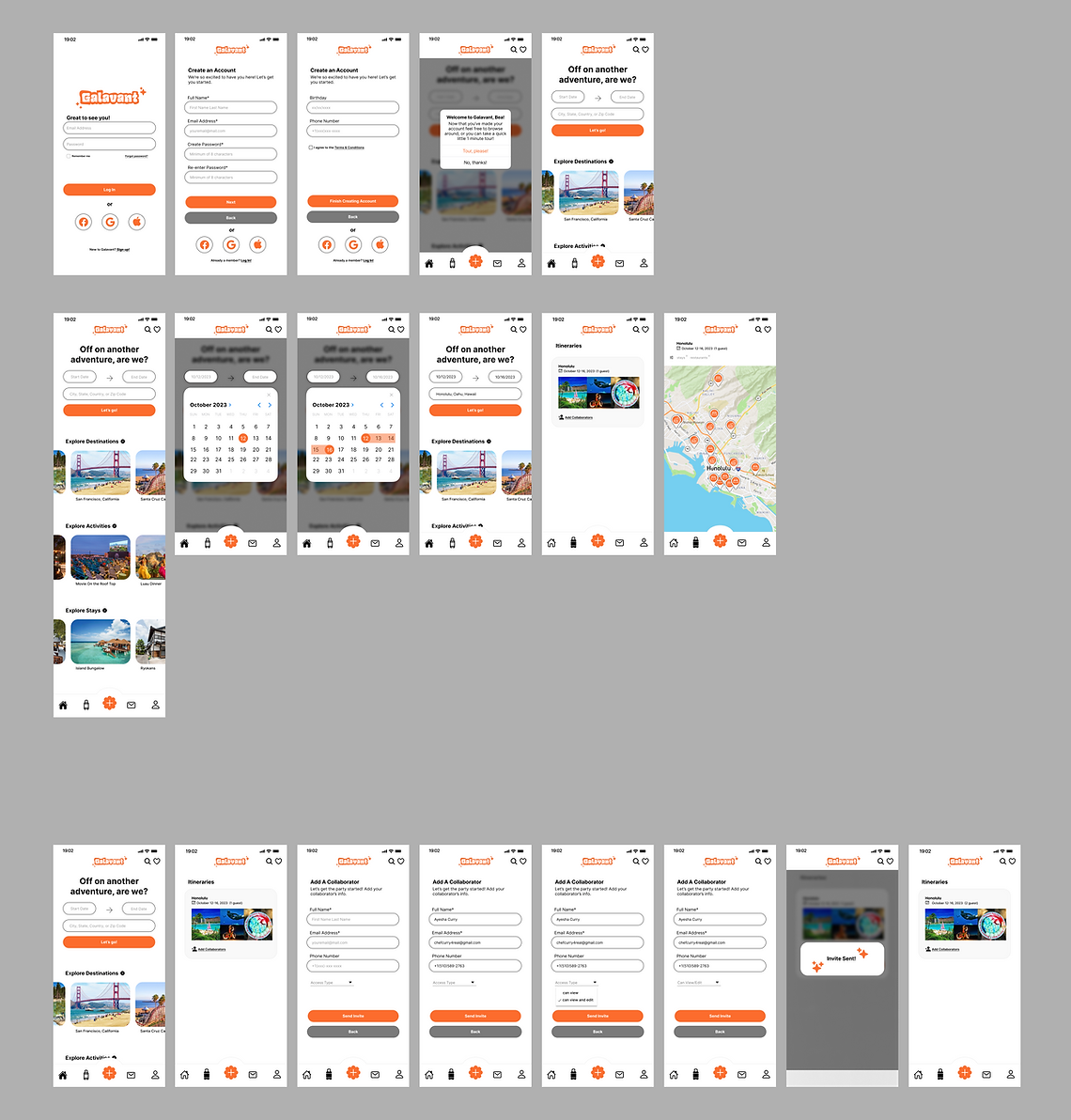
Visual and Brand Design: High Fidelity Wireframe
We tied all of the findings together, and used the mid-fidelity wireframe as a starting point to work off of. Now we have a product that incorporates both the brand pillars in accessibility, while maintaining a uniformed visual appearance.
Deliver Prototypes
Usability Testing: Hybrid Method
Testing out how user’s respond to the current design.

In Person Testing and Results Summary
I conducted in person testing and recorded any feed back during and after. From there I was able to summarize key pain points to make improvements.

Usability Testing: Analysis and Prioritization
I analyzed the feedback to better understand the pain points and how I could best find a solution. From the charts previously, I have a clear direction.
"Sign up button was too small."
Recommendation: Increase font size
Why: Users gravitate to pressing the large ‘Log In’ button when first getting to page before actually having an account (keep in thumb zone)
"I prefer scroll view after itinerary is made"
Recommendation: Add page w/ scroll view similar to landing/home home page
Why: Users like to search by category and have more options other than map
"I need clearer exit routes. (in prototype)"
Recommendation: Add clear exit routes or make footer icons clickable
Why: More familiar for users and better restart point
Iterations
This is where I made some adjustments to the high fidelity wireframes. This allowed for improvements in final design.
Sign Up Page
Here I went from a minimum size of 14 pt. font to 16 pt. font that made a huge difference especially in the prototype phase. User’s eye is much more inclined to look for this when they know Signing Up is the task.


Exit Routes
The original design only implied that you could click the luggage to go back to Itineraries, but in the revised design I made more usable exit routes even in the prototype mode.
.png)

List View
Previously, there was only the option of browsing by scanning a map, but it was edited to allow user’s to toggle between views.
.png)


